healthAbility: Award winning Brand Transformation
WINNER: Transform Awards ANZ
Gold: Best corporate rebrand following a merger or acquisition
Bronze: Best visual identity from the healthcare and pharmaceutical sector
Bringing a community together.
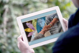
Following healthAbility’s merger with a neighbouring community health provider, the organisation continued to operate under a family of brands. After an in-depth and extensive brand strategy, along with research and development by Intent Creative, a decision was made to unite all services together under one name, healthAbility, to truly bring the community together.
ClienthealthAbilityServicesBrand Strategy | Branding | Design | Art DirectionLinkhealthability.org.au
Mapping the path forward
Intent Creative was engaged to facilitate the path forward to a unified brand. This pivotal and in-depth project commenced with foundational brand strategy work, and designing and facilitating a naming workshop. Once the decision was made to move forward under the name healthAbility, a complete brand refresh commenced.
A complete end-to-end solution with a human-centred focus
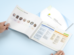
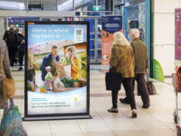
This brand refresh process involved auditing, research, brand strategy, audience & service mapping, stakeholder engagement, co-design, collaboration with communications teams, project management, art direction, design, production, and training.
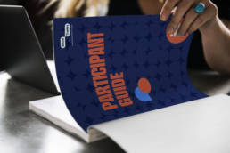
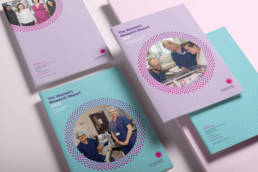
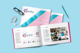
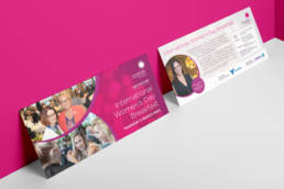
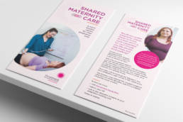
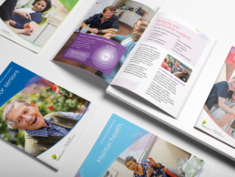
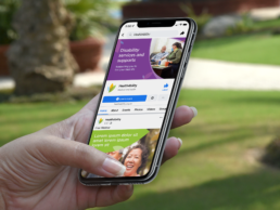
A compassionate, human-centred approach was taken to build optimism and provide clarity. Progressing from the development of an extensive brand and communications guide, the supporting visual language and colour palette have been refreshed, and an entirely new image library created. All of these elements guided by the brand strategy and been applied across an extensive range of internal, external, digital and physical touchpoints.


Designing with and for the community
A co‑design process involving collaboration with service team leaders ensured that communication needs were front of mind, and that the collateral produced would be accessible, feasible, and follow a person-centred approach.
Whilst this collaborative process was progressing, a campaign for the Transition to One Name was developed to introduce audiences who identify with the existing family of brands, to the new, unified name of healthAbility. Please visit this page to find out more about the campaign: healthAbility transition to one name
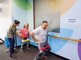
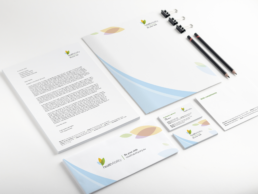
A human-centred and strategic approach has meant that the updated branding and assets have not only been refreshed, but each resulting piece of communication is effective, appropriate and purposeful.
Internal templates created were tested and successfully adopted by staff. Signage is accessible, welcoming, and designed to meet client needs. The brand and com88munications guide includes guidance for creating accessible visual and verbal communications. Every step in this transformation carefully represents the organisation’s person‑centred values and most importantly, ensured healthAbility’s path forward to bringing the their community together was successful.
You can read more in the case study published here on Medium: A brand transformation in community health
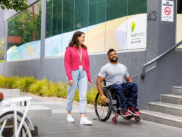
Image credit: Full credit to Image Workshop Photography for their exceptional work creating a beautiful new image library for the refreshed healthAbility brand, some of which you can see here.
